We are so excited to announce that we recently unveiled a new logo! As a graphic designer, I find it so hard to design for myself… Nothing is ever good enough (I am my own worst client)! I’m also a perfectionist. However, over the years, I have learned to let go of my fears and insecurities about releasing art into the world that may not be 100% perfect or finished in my eyes (again, I am a perfectionist, so nothing is ever complete or without flaws). Instead of hemming and hawing for weeks (sometimes months!) about whether or not not a particular design project is done, when I complete something, that’s it… I try to be done with it and release it out into the world. Which is such a freeing feeling! That’s why I love the Etsy shop I launched… it’s just me being creative and posting my work.
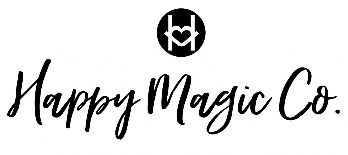
It was while I was relaunching the Etsy shop that I started to tweak our logo. It wasn’t planned, sometimes the best things aren’t. It just sort of happened because I needed/wanted a logo to represent my design products. So I took our logo and tweaked it for my design needs. Only thing… after a few weeks, I began to really LOVE the simplicity of this new logo. So I ultimately decided to adapt it for the actual Happy Magic brand! And guys, I couldn’t be happier!
Quick little side story. I used to dread designing logos for clients (I actually told my boss on my job interview over five years ago, that I didn't like designing them)... well, flash forward to the present and logos are my ALL-TIME FAVORITE thing to create! I just love how you get to play such a huge role in establishing a company's look and feel. It's truly so creative. And over the years I've designed logos for all different types of clients... education, healthcare, local government, real estate, etc. And a few of my logos have even won awards, which is so awersome!
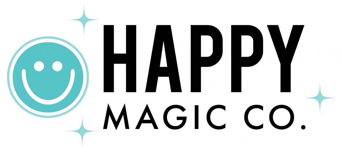
Enough of me rambling... without further ado, here is the new logo!
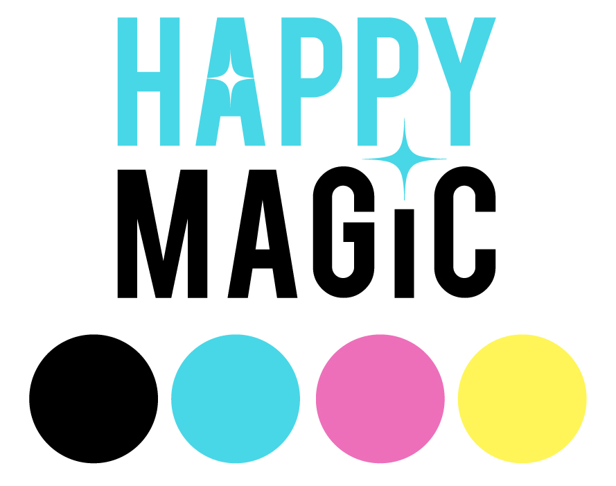
To the untrained eye, it may be hard to spot the differences. But they’re there… trust me! The big thing that I did was remove the logo mark, that Eric and I called our “HAPPY.” I really enjoyed that mark… it was totally fun and so us! However, I felt that we had outgrown it. Plus, I wanted the logo to be more simple.
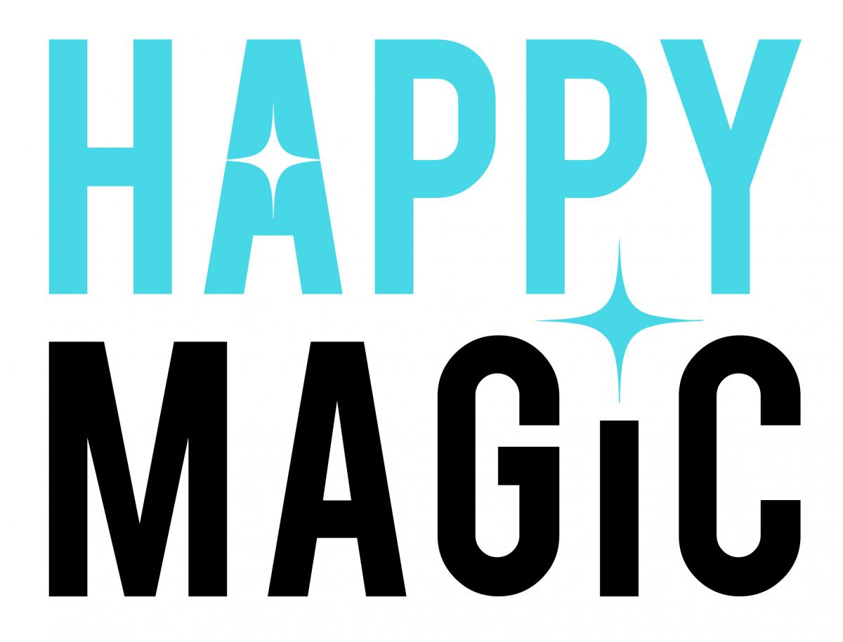
Another thing that I did was I update the font. It’s now bolder and more dynamic. The typeface that was used in HAPPY is now carried over and is used for MAGIC. However, I customized the font and made it totally our own by adding a bit of magic in the form of the sparkles (you can see it the A and the dot of the i).
That’s the logo. I hope you like it… I really do! I feel like this new look is totally us and feels so right. This is a logo I am so proud of (and the crazy thing is, like I said before... I wasn't even planning to redesign our look)! If you have any design related questions, leave me a comment or send me an email. I love talking design!
![]()